Sulking Room Pink A Deep Dive into History, Design & Emotion
There’s something undeniably captivating about a color that evokes both melancholy and quiet luxury. “Sulking Room Pink,” a shade steeped in history and surprisingly complex psychology, has recently resurfaced in design and fashion. It’s more than just a pretty hue; it’s a portal to a fascinating story involving Winston Churchill, nuanced emotional responses, and a surprising versatility across various creative fields.
We’ll be exploring its origins, its impact on our moods, and how you can incorporate this intriguing color into your own life, from interior spaces to your wardrobe.
This exploration goes beyond a simple color guide. We’ll unpack the cultural significance of this particular pink, examining how it’s perceived differently around the world and how its meaning has shifted over time. From its historical roots to its modern applications, we’ll uncover the secrets behind “Sulking Room Pink” and why it’s experiencing a resurgence in popularity.
The Enigmatic Allure of Sulking Room Pink
There’s a color that whispers of quiet contemplation, of faded grandeur and a touch of melancholy. It’s not a vibrant, attention-grabbing hue, but rather a subtle, almost secretive shade – Sulking Room Pink. This color, steeped in history and layered with psychological associations, has recently experienced a resurgence in popularity, appearing in everything from interior design to fashion. But what exactly
-is* Sulking Room Pink, where did it come from, and why does it evoke such a specific feeling?
Let’s delve into the fascinating world of this unique color.
Historical Context of “Sulking Room Pink”
The term “Sulking Room Pink” originates from Winston Churchill, who famously described it as the color of a room where one goes to sulk. While the exact origin of Churchill’s use of the term is debated, it’s generally believed he encountered it during his time as a young officer in the late 19th century. The phrase likely gained traction during a period of Victorian and Edwardian social conventions, where designated spaces for private reflection and emotional processing were common, particularly for women.
- The Shade Itself: Churchill didn’t specify a precise color code, but descriptions suggest a muted, dusky pink with grey or mauve undertones. It’s not a bright, cheerful pink like bubblegum or flamingo; instead, it’s a more complex and subdued shade, leaning towards a dusty rose or antique pink.
- The Social Climate: The late 1800s and early 1900s were marked by strict social etiquette and a focus on maintaining appearances. Emotional displays were often discouraged, particularly for women, leading to the creation of spaces where individuals could privately process their feelings. The “sulking room” and its associated pink color became a symbol of this controlled emotional expression.
- Timeline of Usage: While Churchill’s reference is the most well-known, the term likely existed in colloquial usage before his popularization of it. Its prominence peaked in the early 20th century, then faded somewhat until its recent revival. The color itself, however, has been used in interior design and fashion for centuries, though rarely with this specific name.
Color Psychology and “Sulking Room Pink”
Pink, in general, is often associated with femininity, romance, and nurturing. However, the psychological effects of color are complex and nuanced, varying depending on the specific hue and cultural context. “Sulking Room Pink,” with its muted and greyed tones, evokes a different set of emotions than brighter pinks.
- Psychological Effects of Pink: Brighter pinks can be stimulating and energetic, while softer pinks are often linked to feelings of calmness and tenderness. However, excessive exposure to pink can also lead to feelings of passivity or even boredom.
- The “Sulking Room Pink” Modification: The grey or mauve undertones in “Sulking Room Pink” temper the typically positive associations of pink. It introduces a sense of melancholy, introspection, and quiet contemplation. It’s a color that encourages reflection rather than exuberant joy.
- Comparison to Other Pink Shades: Dusty rose is similar but often warmer and more romantic. Antique pink has a more vintage and faded quality. Salmon is more vibrant and energetic. Blush is a very pale, almost neutral pink. “Sulking Room Pink” distinguishes itself with its deeper, more complex undertones and its association with a specific emotional state.
- Cultural Differences: In some cultures, pink is strongly associated with femininity and childhood. In others, it can represent good luck or prosperity. The emotional impact of “Sulking Room Pink” is likely to be influenced by these cultural associations.
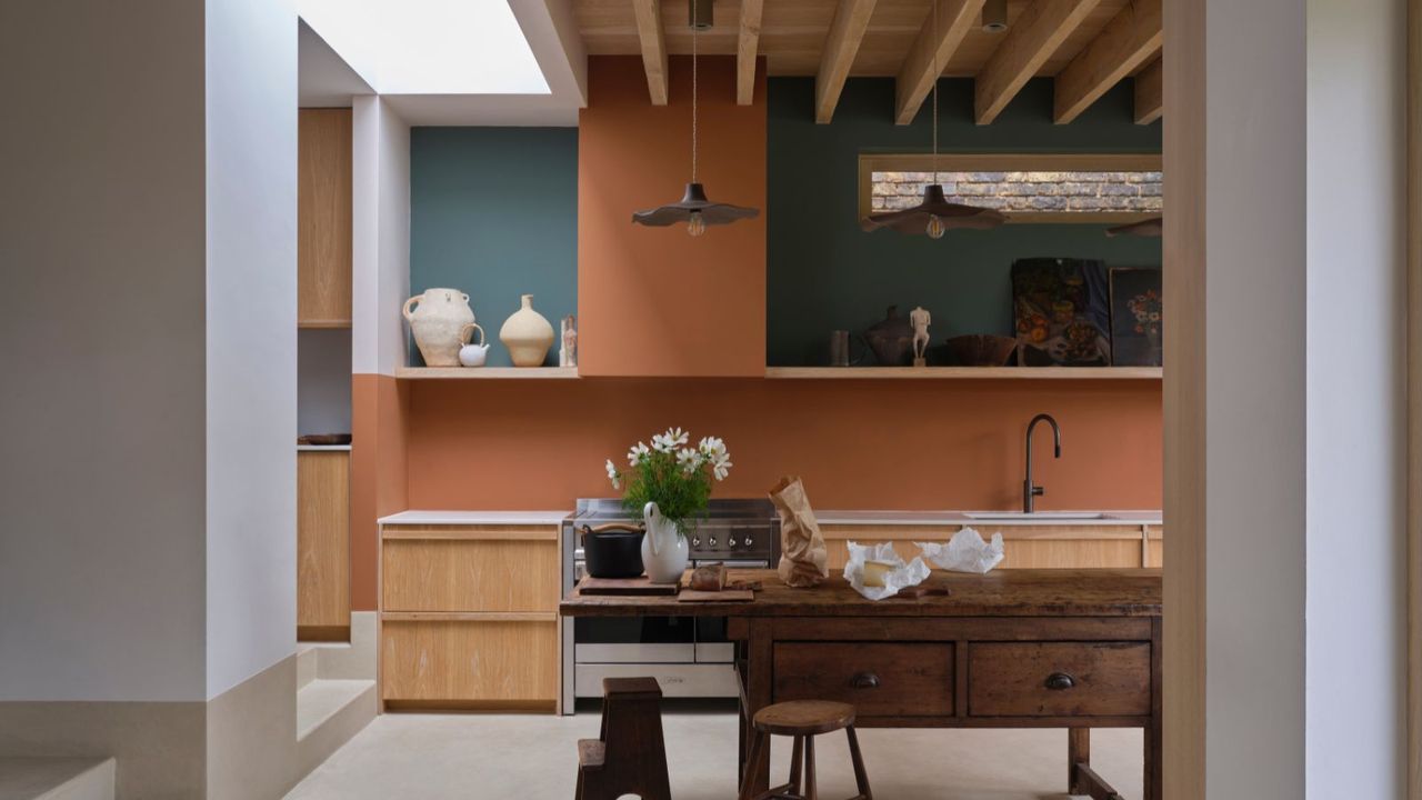
Interior Design Applications of “Sulking Room Pink”
Incorporating “Sulking Room Pink” into interior design requires a delicate balance. It’s a powerful color that can easily overwhelm a space if not used thoughtfully. The key is to pair it with complementary colors and textures to create a harmonious and inviting atmosphere.
| Room Type | Color Palette (including accent colors) | Furniture Style | Lighting Scheme |
|---|---|---|---|
| Bedroom | Sulking Room Pink, Cream, Gold accents, Charcoal Grey | Victorian, plush velvet, antique furniture | Warm, diffused, bedside lamps with amber-toned bulbs, a single chandelier with soft lighting |
| Living Room | Sulking Room Pink, Charcoal Grey, Brass, Deep Teal | Mid-Century Modern, clean lines, geometric patterns | Statement chandelier with brass accents, recessed lighting with dimmers, floor lamp with a linen shade |
| Study | Sulking Room Pink, Deep Green, Walnut, Copper | Traditional, leather accents, built-in bookshelves | Task lighting with adjustable arms, a large floor lamp with a warm-toned bulb, ambient lighting from sconces |
Balancing “Sulking Room Pink” is crucial. Pairing it with neutral colors like cream, grey, or beige creates a calming and sophisticated look. Adding metallic accents like gold or brass introduces warmth and luxury. Contrasting it with darker shades like charcoal grey or deep green adds depth and prevents the space from feeling too saccharine. Avoid pairing it with overly bright or saturated colors, as this can create a jarring and chaotic effect.
Fashion and “Sulking Room Pink”
Translating the mood of “Sulking Room Pink” into fashion requires a similar approach to interior design – subtlety and thoughtful pairing. It’s a color that works best when incorporated in a sophisticated and understated way.
- Incorporation into Styles: “Sulking Room Pink” can be surprisingly versatile. In a classic style, it can be used for a tailored blazer or a silk blouse. In a bohemian style, it can be incorporated through flowing dresses or embroidered details. In a modern style, it can be used for minimalist separates or statement accessories.
- Mood Board Description: Imagine a silk slip dress in “Sulking Room Pink,” paired with a chunky knit cardigan in charcoal grey. Accessorize with delicate gold jewelry and a pair of leather ankle boots. The silhouette is relaxed and effortless, with a touch of vintage glamour. The fabric textures – the smooth silk and the cozy knit – add depth and interest.
- Challenges and Opportunities: Wearing “Sulking Room Pink” can be challenging, as it’s not a universally flattering color. However, it can be incredibly striking when paired with the right skin tone and outfit. It’s best suited for settings where a touch of understated elegance is appreciated.
- Comparison to Trending Colors: While brighter pinks like fuchsia and magenta are currently trending, “Sulking Room Pink” offers a more timeless and sophisticated alternative. It’s a color that transcends fleeting trends and embodies a sense of enduring style.
Artistic Interpretations of “Sulking Room Pink”
The evocative nature of “Sulking Room Pink” makes it a compelling subject for artistic exploration. Its ability to convey complex emotions and create a specific atmosphere lends itself well to various artistic mediums.
- Painting: Imagine a large-scale oil painting depicting a solitary figure sitting in a dimly lit room, bathed in the soft glow of “Sulking Room Pink.” The brushstrokes are loose and expressive, conveying a sense of melancholy and introspection. The composition is simple, with the figure occupying the center of the frame, emphasizing their isolation.
- Sculpture: A sculpture crafted from polished rose quartz, subtly tinted with grey, could embody the essence of “Sulking Room Pink.” The form is organic and flowing, resembling a gently curving wave or a stylized human form. The texture is smooth and cool to the touch, evoking a sense of quiet contemplation.
- Digital Artwork: A digital artwork could utilize “Sulking Room Pink” as a backdrop for a series of abstract shapes and forms. The color gradients shift subtly, creating a sense of depth and movement. The use of light and shadow is carefully controlled, emphasizing the color’s inherent moodiness.
- Poem: “A blush of twilight, a whispered sigh,/Sulking Room Pink, where shadows lie./A memory held, a silent tear,/A space for solace, banishing fear.”
Cultural Significance and Symbolism
The interpretation of “Sulking Room Pink” varies across cultures, reflecting different historical and social contexts. While it may evoke feelings of nostalgia and melancholy in Western cultures, it could be perceived differently elsewhere.
- Cross-Cultural Interpretations: In some Asian cultures, pink is associated with happiness and good fortune. The addition of grey or mauve undertones might alter this perception, creating a more complex and nuanced meaning.
- Symbolic Meanings: In literature and art, “Sulking Room Pink” often symbolizes introspection, melancholy, and a longing for the past. It can also represent a sense of quiet strength and resilience.
- Themes of Nostalgia and Introspection: The color’s muted tones and association with private spaces evoke a sense of nostalgia and introspection. It encourages reflection on personal experiences and emotions.
- Evolution of Perception: As social norms evolve, the perception of “Sulking Room Pink” is likely to change. What was once associated with Victorian-era constraints may now be seen as a symbol of self-care and emotional well-being.
Material Properties and “Sulking Room Pink”
The appearance of “Sulking Room Pink” is significantly influenced by the material it’s applied to and the lighting conditions. The same shade can look dramatically different on velvet versus silk, or under natural versus artificial light.
- Appearance on Different Materials: On velvet, “Sulking Room Pink” appears rich and luxurious, with a deep, velvety texture. On silk, it appears more delicate and ethereal. On matte paint, it appears muted and understated. On glossy tile, it appears more vibrant and reflective.
- Impact of Lighting: Natural light tends to soften the color, while artificial light can intensify it. Warm light sources (like incandescent bulbs) enhance the pink tones, while cool light sources (like fluorescent bulbs) can make it appear more greyish.
- Effect of Texture: A rough or textured surface will diffuse the color, making it appear less intense. A smooth surface will reflect the color more evenly, making it appear more vibrant.
“In the dim glow of candlelight, Sulking Room Pink takes on a velvety depth, a hushed and introspective quality. It seems to absorb the light, radiating a subtle warmth that invites quiet contemplation. Under the harsh glare of daylight, however, the color reveals a more assertive presence, a vibrant hue that demands attention and exudes a quiet confidence.”
Variations and Related Shades
Source: futurecdn.net
While “Sulking Room Pink” possesses a distinct character, it shares similarities with several other pink shades. Understanding these nuances can help you choose the perfect hue for your specific needs.
- Related Shades: Dusty Rose, Antique Pink, Salmon, Blush, Rose Quartz.
- Visual Comparison: Dusty Rose is warmer and more muted than “Sulking Room Pink.” Antique Pink has a more faded and vintage feel. Salmon is more vibrant and orange-toned. Blush is a very pale, almost neutral pink. Rose Quartz is a softer, more pastel pink. “Sulking Room Pink” sits in between Dusty Rose and Antique Pink, possessing a deeper, more complex undertone.
- Appropriate Situations: Dusty Rose is ideal for creating a romantic and inviting atmosphere. Antique Pink is perfect for vintage-inspired designs. Salmon is a good choice for adding a pop of color. Blush is a versatile neutral that can be used in a variety of settings. Rose Quartz is well-suited for creating a calming and serene space.
“Sulking Room Pink” is best used when a touch of melancholy and introspection is desired.
- Color Codes: “Sulking Room Pink” (approximate): RGB(220, 190, 210), Hex #DCBFD
2. Dusty Rose: RGB(240, 200, 220), Hex #F0C8D
4. Antique Pink: RGB(230, 180, 200), Hex #E6B4C
8. Salmon: RGB(250, 128, 114), Hex #FA
8072. Blush: RGB(255, 240, 245), Hex #FFF0F
5.Rose Quartz: RGB(255, 238, 238), Hex #FFE6E6.
Final Conclusion
From Churchill’s private refuge to contemporary design trends, “Sulking Room Pink” demonstrates the enduring power of color to shape our emotions and environments. We’ve seen how this shade can be both introspective and surprisingly bold, depending on its application and the surrounding palette. Whether you’re drawn to its historical significance, its psychological depth, or its aesthetic appeal, understanding “Sulking Room Pink” offers a unique lens through which to appreciate the complexities of color and its impact on our lives.
It’s a color that invites contemplation, a touch of drama, and a whole lot of personality.
Key Questions Answered
What exactly
-is* “Sulking Room Pink”?
It’s a specific, dusky shade of pink, often described as a muted rose or a dusty blush. It’s not a bright, bubblegum pink, but rather a more sophisticated and subdued hue.
Why is it called “Sulking Room Pink”?
The term originates from Winston Churchill, who reportedly used the phrase to describe a particular shade of pink in his private room, where he would retreat to when feeling down or needing solitude.
Is “Sulking Room Pink” difficult to work with in interior design?
Not necessarily! While it’s a strong color, it pairs well with neutrals like cream, charcoal grey, and deep green. The key is to balance it with contrasting elements to avoid a monotonous look.
Can I wear “Sulking Room Pink” if I don’t want to look overly feminine?
Absolutely! Paired with tailored pieces, dark denim, or edgy accessories, “Sulking Room Pink” can be surprisingly versatile and create a chic, modern look.
What’s the difference between “Sulking Room Pink” and dusty rose?
While similar, “Sulking Room Pink” tends to be slightly deeper and more muted than dusty rose. Dusty rose often has a touch more peach or coral undertones.